TLDR:
- WGSN named Transformative Teal as Color of the Year 2026, while Pantone chose Cloud Dancer, an off-white—marking a rare industry split
- Bright red is already selling 50% more and bridging winter into spring trends across major retailers, while not a “new” color, it still rocks
- Five core colors define Spring/Summer 2026: Transformative Teal, Electric Fuchsia, Blue Aura, Amber Haze, and Jelly Mint
- Fashion houses like Valentino, Versace, and Chloé used them in Paris, New York, and Milan runways months ago
The Game Most People Lose Before It Starts
Here’s what happens every single year. Regular folks pick colors because they like them. They see a sweater they want (I do that…), a wall color that feels right, maybe a design that speaks to them. Personal taste drives everything, and hey, we are all different and that’s ok.
But…and it’s a big one…Pinterest and fashion brands don’t think like you and I do. They test colors on focus groups. They analyze what people respond to emotionally before they’re even aware of it. They study runway shows from Paris Fashion Week and track search behavior across millions of users. Then they train all of us to fall in love with whatever they decide to push that season. So…basically they tell us what we have to like.
WGSN and Coloro announced Transformative Teal as their Color of the Year 2026 back in September 2024, a full 16 months before the year even started. They looked at consumer behavior, saw a 9% year-over-year increase in teal searches, tracked climate anxiety driving demand for nature-connected colors, and called it early.
But here’s where it gets interesting. Pantone broke ranks and chose Cloud Dancer, an off-white, as their 2026 pick. This almost never happens. When the two biggest color authorities in the world disagree, it tells you something about where we are culturally. One side sees transformation and ecological reckoning. The other sees exhaustion and a need for calm.
This post is a deep-ish dive into the best colors for 2026, so that you can make an educated decision on how to implement them in your Pinterst strategy, without or with the help of WordPin.
What Colors are Actually Selling in 2025
Walk into any Lululemon or browse Zara’s site, and you’ll see them: chocolate browns, moss greens, and stone neutrals still dominate. These colors owned winter 2024 and carried into 2025. They’re cool, I do own a few items myself. They are cozy, earthy, and comfy.
But something’s changing. Red is up over 50% in sales as of October 2025, according to Stitch Fix data. Not burgundy. Not wine. Loud, fire-engine, look-at-me and shut up red.
Alo dropped an entire line called “Bright Red”. Chanel and Ralph Lauren filled their spring catwalks with fiery red looks. Red bridges the gap between winter’s moody earth tones and spring’s vibrant energy. It’s bold enough to feel fresh but familiar enough that it doesn’t scare off buyers still clinging to neutrals.
Did you know? Red apparel sales jumped 32% globally following Resort 2026 collections, with the color showing up not just in eveningwear but in streetwear and activewear too. That cross-category appeal means brands see evergreen and not seasonal trends.
The Colors Running 2026
| Color | Hex Code Approximation | Best Used For | Peak Season |
|---|---|---|---|
| Bright Red | #FF0000 | Transition pieces, statements | Now – Spring |
| Transformative Teal | #008B8B | Hero color, full collections | Spring/Summer |
| Electric Fuchsia | #FF00FF | Accents, logos, graphics | Summer |
| Blue Aura | #A4DDED | Base neutral, versatile staples | Spring/Summer |
| Amber Haze | #D4A574 | Accessories, warm accents | Summer |
| Jelly Mint | #B5EAD7 | Wellness, athleisure, lifestyle | March/April peak |
| Bubblegum Pink | #FFC1CC | All categories, universal appeal | Spring/Summer |
WGSN and Coloro identified five specific colors for Spring/Summer 2026. Each one connects to larger cultural shifts, and each one’s already been road-tested on runways worldwide.
Below you can find the most trendy colors you can use in 2026 for your Pinterest pins and your everyday design projects.
Transformative Teal: The Heavy Hitter
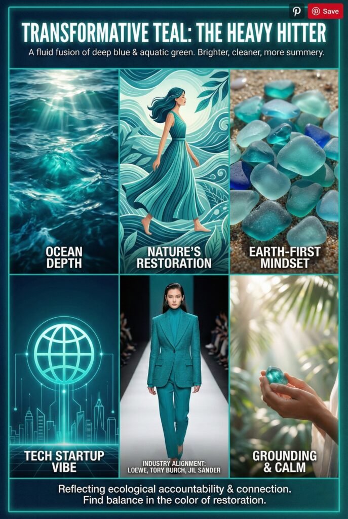
This color’s a fluid fusion of deep blue and aquatic green. Think ocean depth meets tech startup. It evolved directly from winter’s moss and olive greens but feels brighter, cleaner, more summery.
Why teal? Climate anxiety. WGSN describes it as reflecting “an Earth-first mindset” and tapping into ecological accountability that consumers increasingly demand. It represents restoration, calm, and connection to oceans and nature. When people feel overwhelmed by environmental disasters and political chaos, they reach for colors that ground them in something bigger. My wife actually loves this color and half or the items in our house are this watery-calmy-teal color.
Let alone, Low, Tory Burch, Jill Sander, Valentino, and Versace all went head-to-toe blue on their runways.
Electric Fuchsia: The Attention Grabber
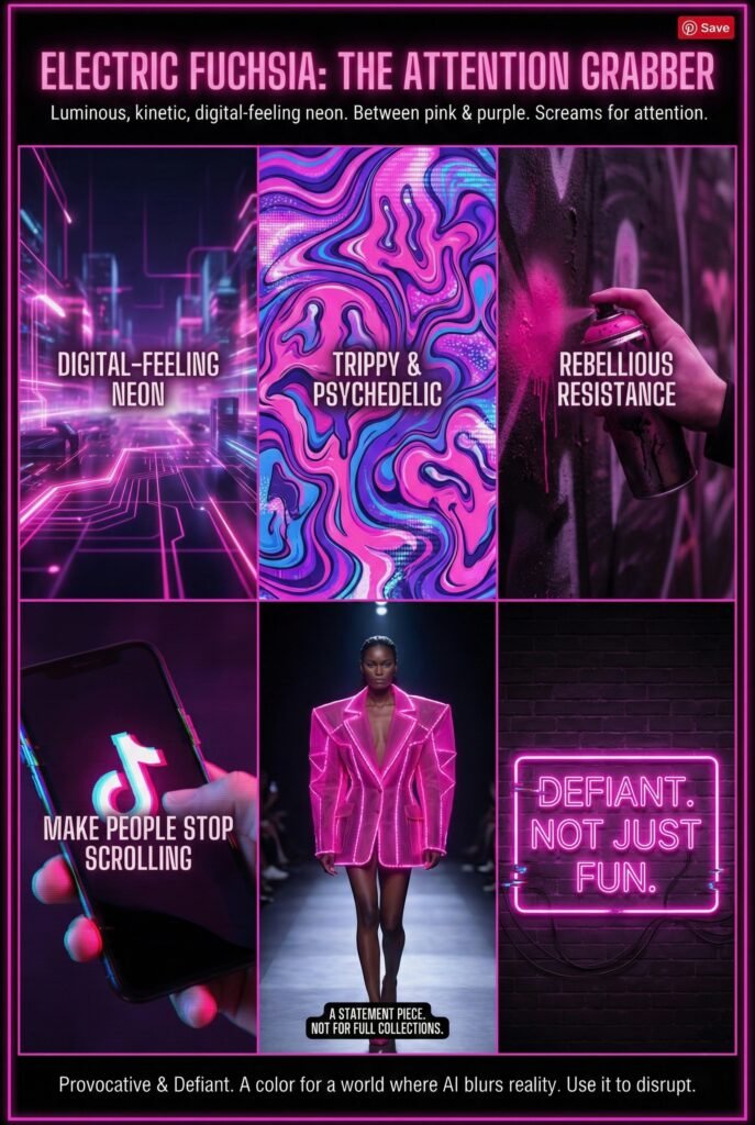
Here’s where 2026 gets weird. Electric Fuchsia sits between pink and purple—a luminous, kinetic, digital-feeling neon that screams for attention. It’s trippy, psychedelic, and built for a world where AI blurs reality and virtual experiences.
This color connects to “Rebellious Resistance” themes. People are angry about social inequalities, frustrated with systems that don’t work, and craving something provocative. Electric Fuchsia isn’t for building full collections. It’s for making people stop scrolling. A stripe. A logo.
Think about it: when was the last time neon ruled fashion? The late 80s and early 90s. Now it’s back, but with a purpose. It’s a defiant i-don’t-care color.
Blue Aura: The New Neutral
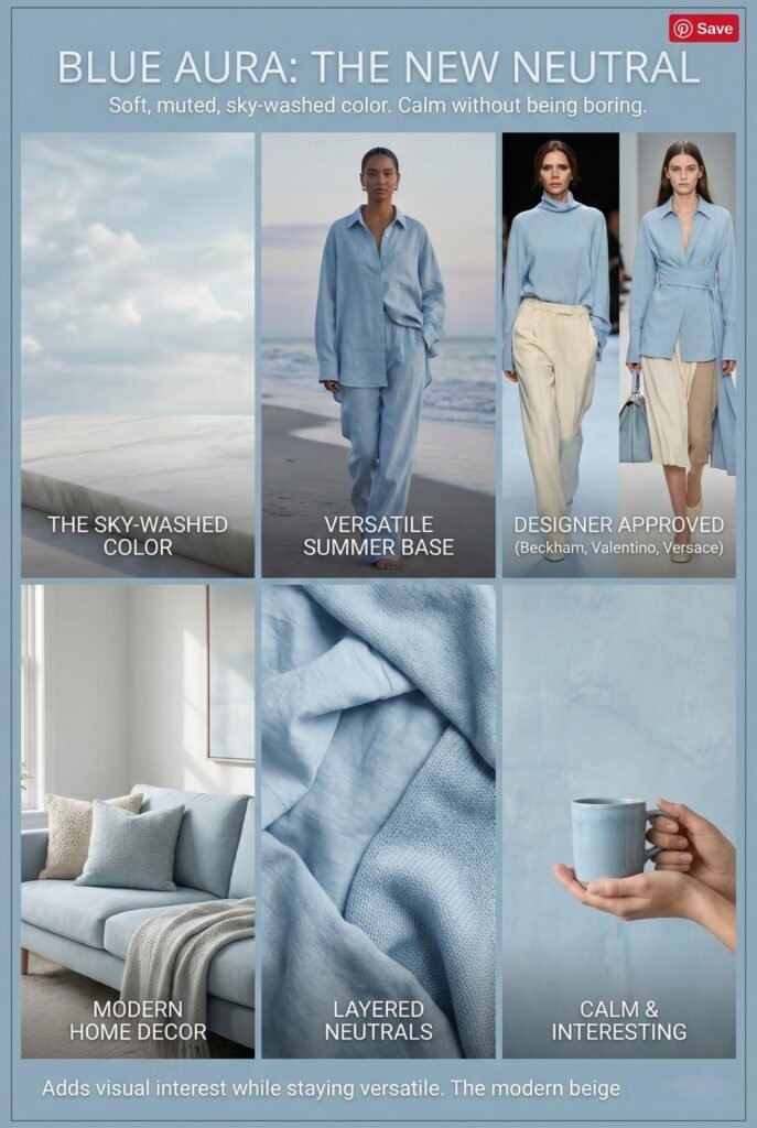
Blue Aura is that soft, muted, sky-washed color you get when you lie on stone and look up. It’s calm without being boring. Victoria Beckham, Valentino, and Versace already paired it with everything.
This becomes one of your base neutrals for summer. Unlike stark white or gray, Blue Aura adds visual interest while staying versatile. People will layer it into tees, matching sets, pillows, home decor—basically anywhere they’d normally use beige or cream. It feels modern without trying too hard.
Amber Haze: The Warm Glow
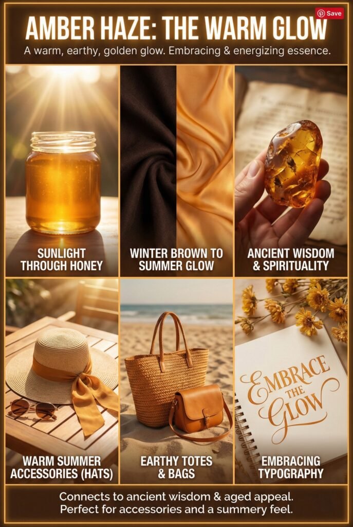
Now look at sunlight shining through honey. That’s Amber Haze—a warm, earthy, golden glow that transforms winter’s deep chocolate browns into something bright and rich for summer. Really warm, grounding and calming.
WGSN describes it as having “an embracing and energizing essence” that connects to searches for spirituality and ancient wisdom during uncertain times. Its aged appeal, reminiscent of stones and crystals, taps into that collective desire for guidance from the past.
This color works beautifully on accessories. Hats, totes, bags, even typography. Anything needing that warm summery feel.
Jelly Mint: The Calmer
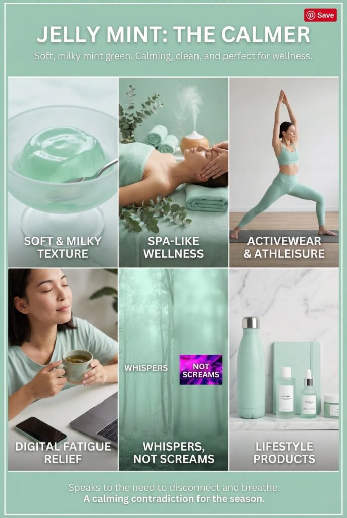
Jelly Mint is soft, milky mint green, calming, clean, and perfect for wellness, athleisure, or lifestyle products. Forecasters list it as one of the top five colors for spring and summer, and spa-like tones are already sneaking into activewear markets.
This color speaks to exhaustion. Digital fatigue (we all have it). The need to disconnect. While Electric Fuchsia screams, Jelly Mint whispers. Both exist in the same season because we’re living in contradictions right now. Some days you want to rage. Other days you want to breathe.
Bubblegum Pink: The Crowd Favorite
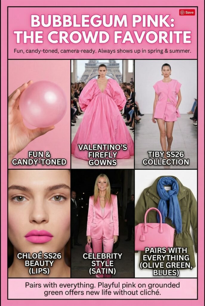
Pink always shows up in spring and summer, but 2026’s version is specific: bubblegum pink. Fun, candy-toned, camera-ready.
Valentino’s Firefly show in Paris packed the runway with bubblegum pink gowns. Tiby’s Spring/Summer 2026 collection went the same direction. Chloé’s SS26 show featured bubblegum pink lips as the focal point of their beauty looks. Even Gwyneth Paltrow traded her signature Goop neutrals for a bubblegum pink satin outfit this December.
The brilliance of bubblegum pink? It pairs with everything. Olive green. Blues. Purples. Neutrals. That playful pink on grounded green combo is showing up everywhere, offering new life without leaning into cliché pastels or florals. My own daughter loves wearing it with blue jeans.
The Color War: Teal vs. White
Now here’s where the story gets philosophical. Two major color institutes picked completely different directions for 2026, and both are right.
WGSN and Coloro chose Transformative Teal: a color about change, resilience, and ecological responsibility. It’s active. It demands action. It says the world’s broken and we need to fix it.
Pantone chose Cloud Dancer: an off-white symbolizing new beginnings, clarity, and calm. Executive Director Leatrice Eiseman calls it “a soothing presence in a chaotic world, encouraging a return to thoughtful consideration and peaceful introspection”. It’s passive. It says we’re overstimulated and need to reset.
Both address the same problem from opposite angles. We’re living through what psychologists call “polycrisis”, multiple overlapping crises creating decision fatigue. Some people respond by wanting to take action (teal). Others respond by wanting to retreat (white).
Here’s the insight most articles miss:
The smartest brands will use both. Teal for products targeting activists, environmentalists, and change-makers. White for products targeting exhausted professionals, burnt-out parents, and anyone craving simplicity.
What Pinterest’s Data Tells You That Runways Don’t
Here’s the part nobody talks about: runway shows predict what fashion houses want. Pinterest predicts what regular people actually search for.
Pinterest analyzed search behavior from September 2023 to August 2025,comparing year-over-year patterns to identify “not-yet-trending” signals for 2026. They’re data points showing what people type into search bars when nobody’s watching. That matters because Pinterest sits at the intersection of aspiration and intention. People search Pinterest when they’re planning purchases, not just daydreaming…ok, well…some do…
And Pinterest’s color pick for 2026 diverges from both Pantone and WGSN. While Pantone chose Cloud Dancer white and WGSN picked Transformative Teal, Pinterest’s data points to “Cool Blue” as the breakout color. This isn’t teal. This is icy, glacier-inspired, powder blue.
Searches for “glacier aesthetic” jumped 35%. “Icy blue” climbed 50%. “Frosted makeup” exploded 150%. Even “blue drinks aesthetic” rose 55% and “ice blue wedding dress” searches increased 55%.
Why does Pinterest matter specifically? Because it’s where product discovery happens before purchase. Sydney Stanback, Pinterest’s Global Head of Trends, says “people will make these trends their own, put unique spins on each, and ensure that what’s trending never comes at the cost of personal expression”. Translation: Pinterest users actively adapt and accept trends.
Did you know? Trends are growing 4.4x faster now than they were seven years ago, according to Pinterest data. That acceleration means the window to capitalize on emerging colors shrinks every year. Launch too late and you’ve already missed it.
The Pinterest data reveals something fascinating about color psychology in 2026. Just as we mentionend above, cool Blue represents escape, calm, and digital detox—but through a different lens than Pantone’s Cloud Dancer white. White says “I’m opting out.” Cool Blue says “I’m choosing serenity.” One’s passive. The other’s intentional. Both address exhaustion, but Cool Blue still engages with color and emotion rather than retreating to neutrality.
For content creators, designers, and product sellers, this creates opportunity. If you’re building for Pinterest specifically, where 80% of users discover new brands and products, you need Cool Blue in your palette. Pair it with bubblegum pink for that playful contrast. Layer it with Amber Haze for warm-meets-cool balance. Use it as your base neutral instead of white or beige.
The smartest move? Test all three directions. Transformative Teal for your environmentally-conscious audience. Cloud Dancer for your minimalist crowd. Cool Blue for your Pinterest-first strategy. Color isn’t one-size-fits-all anymore. The fragmentation happening across forecasting bodies reflects the fragmentation happening across consumer segments. Different platforms, different values, different colors. Build them all.
What the Runways Already Told Us
Spring 2026 fashion weeks happened months ago. The information’s out there. You just have to look.
Versace showcased bold color pairings—crimson, electric blue, and violet together proving “more is more”. Cobalt blue appeared everywhere from Valentino gowns to Luar’s eye-wateringly vibrant suits. Chartreuse—a sharp yellow-green—emerged at Tibi, then Burberry, Erdem, Simone Rocha, Saint Laurent, Valentino, Balenciaga, and Alaïa.
Designers use trend forecasters who analyze social media sentiment, track retail data, and conduct consumer psychology research…that’s quite a lot of data! And they do that because by the time clothes hit runways, those colors are already locked in across supply chains.
Did you know? Pantone’s Color of the Year initiative started in 2000 with Cerulean. Cloud Dancer marks only the second time they’ve chosen a shade this light—the first was Sand Dollar in 2006.
The Insight No One’s Talking About
Here’s what’s different about 2026: the split between competing visions is a feature. For years, color forecasting felt monolithic. Everyone agreed. Everyone pushed the same palette. Stores looked identical…kinda of boring, right?
That’s changing. We’re fragmenting into micro-cultures with different values, different aesthetics, different needs. Some people want bright, bold, rebellious colors that reflect anger and energy. Others want soft, calming, neutral tones that offer escape.
The brands that win in 2026 won’t pick one lane. They’ll offer both. A teal hoodie and a white one. A bubblegum pink dress and a stone neutral jumpsuit. Options for different moods, different moments, different versions of yourself.
Where This Leaves You
If you’re launching products, whether clothing, home goods, digital designs, or content, here’s your roadmap:
Launch bright red now. It’s already transitioning from winter’s heavy base tones into spring energy. Sales are climbing. Demand’s proven
Add Transformative Teal next. It’s officially Color of the Year from WGSN, showing up across fashion houses, and connects to the biggest consumer sentiment trend: ecological responsibility.
Layer in the supporting cast: Jelly Mint for March/April when people crave refresh. Blue Aura as your new neutral base. Amber Haze for warm summer vibes. Electric Fuchsia for attention-grabbing accents. Bubblegum pink because it pairs with literally everything.
Don’t ignore Cloud Dancer. Yeah, it’s white. But it’s Pantone’s pick, and millions of designers worldwide follow Pantone religiously. Offer it as an option for the “less is more” crowd.
The Bottom Line
Colors choices are calculated decisions made months in advance, backed by data, tested on runways, and pushed through marketing until they feel natural.
The difference between big brands and everyone else? Big brands see the pattern early. They know Transformative Teal hit a 9% search increase and act on it. They watch Valentino and Versace fill runways with specific colors and understand those aren’t creative whims. All of that is market signals.
You don’t have to guess anymore. The information’s public, and we summarized it for you here on WordPin. WGSN publishes their forecasts. Runway shows stream online. Retail data leaks through reports. The playing field’s more level than it’s ever been.
Most people still won’t use it. They’ll pick colors they like and wonder why nobody buys. But you’re not most people. You know how the game works now. The colors are set. The runway’s been walked. The data’s been collected.
All that’s left is building them into your lineup before everyone else catches up.
We hope you found something interesting in this article, at WordPin we aim to make tools that can help your Pinterest journey, and we strive to provide relevant information that can help your journey, wherever that may bring you.